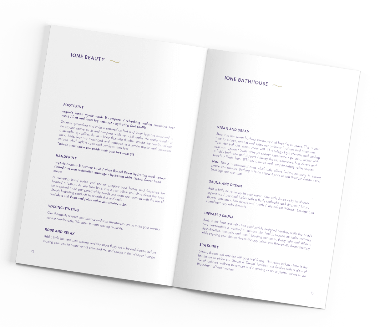
Drift and dream with IONE spa and wellness! One of a kind boutique spa, which embodies wellness in all of its forms, from the use of sensitive non-toxic building materials, to weaving the energetic healing of Rose Quartz and Amethyst throughout the journey, and using luxe organic skin and body products.
Anna and her team were looking for a new brand identity that reflects their new location as well as transformative healing elements of the spa and the indulgent magical experience guestes embark on.
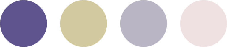
joy, luxury and deep healing
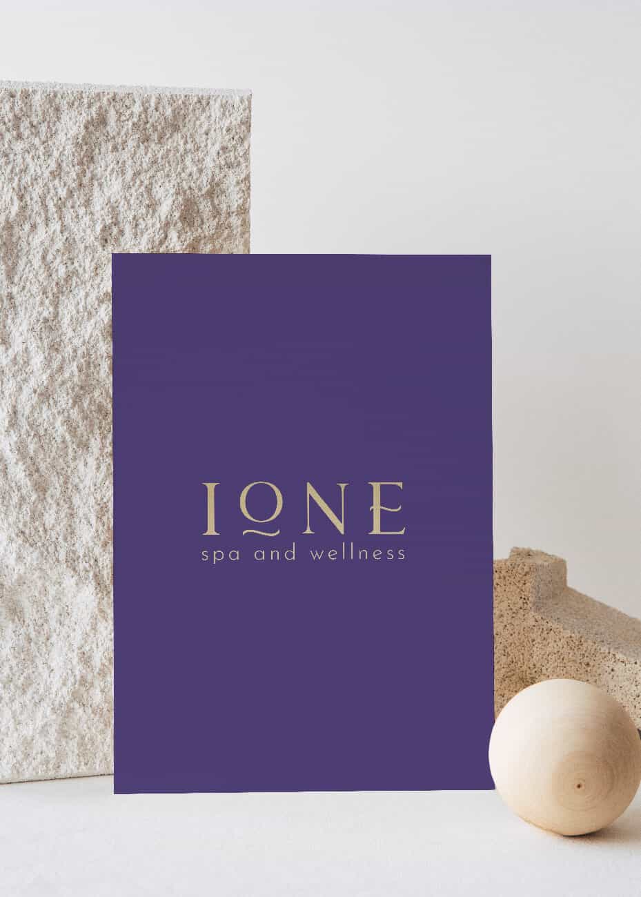
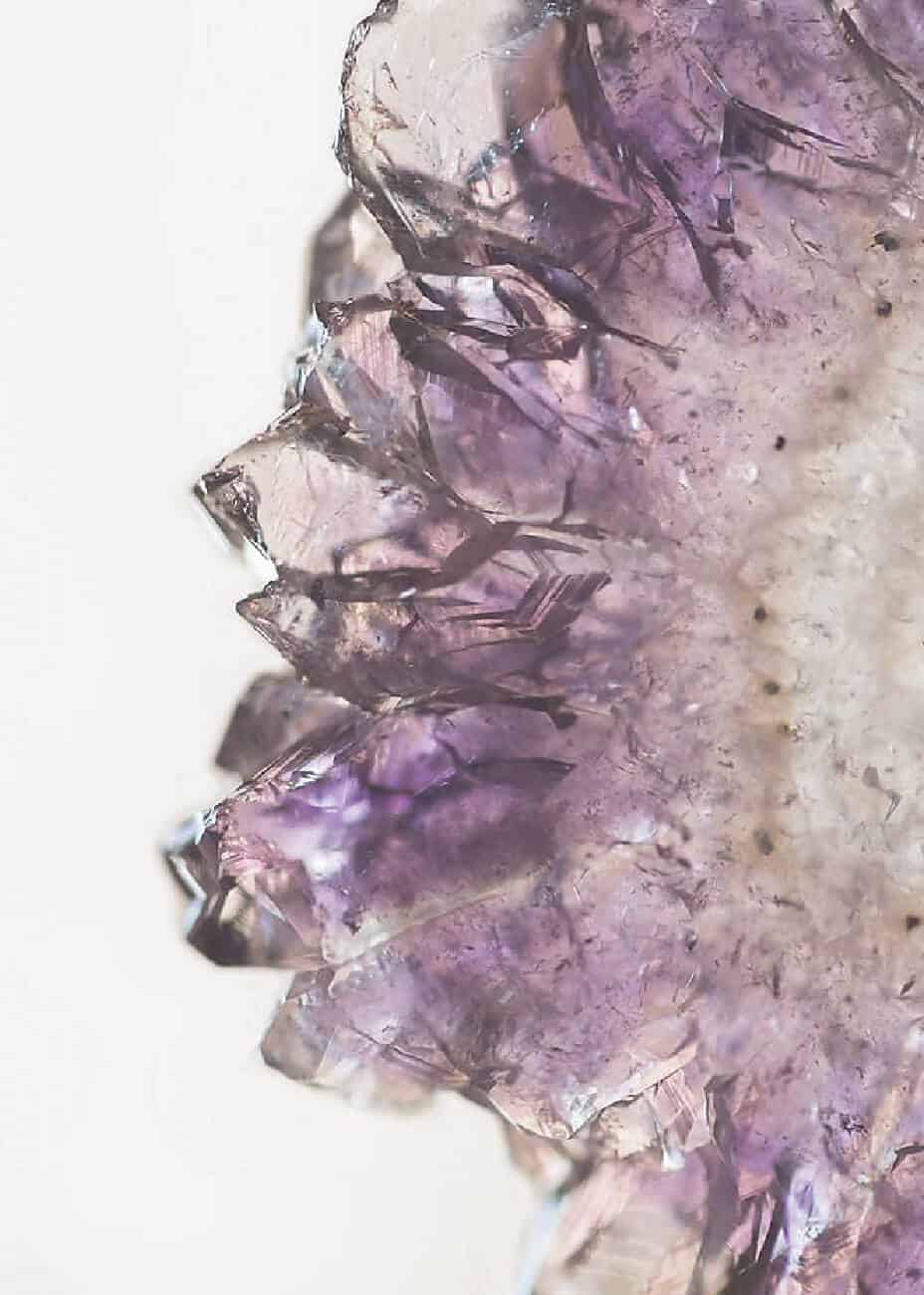
The name IONE means violet, violet flower in Greek and a water spirit, a water nymph, a spirit of the water in ancient mythology. IONE deeply associated with the element of water, strong, healing and joy.
We created a brand identity that captures the essence of IONE’s meaning and embodies elements of water, representing not only the strong healing properties of the spa but also its magnificent location.
Project done in collaboration with Shannon Bain Digital who did a wonderful work on Ione’s website.
Dominika was so in-tune with my complete vision for our new project on our first meeting.
She infused absolute confidence in me that she understood exactly what we wanted and never once failed to deliver.
Her expert skills were merged with an intuitive knowing and she delivered amazing results in such a timely manner. Our team was blown away on her first round of branding suggestions when I shared them – she understood exactly my dreams and visions and brought them to life.
She is a wonderful bright, passionate and humble person that is an absolute pleasure to deal with everytime. Her work ethic is outstanding and I will always be grateful for her creative genius in working on our branding for IONE Spa and Wellness.
I would not hesitate to recommend Dominika’s services to anyone wanting the best.